In December I posted about designing a planner for the new year to meet my needs. Given how briefly I used my planner design last year before giving up it seemed about time for a check-in.
I printed the designs on
Claire Fontaine “Graf- it” paper. This paper is only available in pads, but tears out easily and ran through my cheap HP printer just fine. The paper is 8x11 instead of standard letter and I sometimes miss that extra half an inch, but I really enjoy being able to use watercolors in my planner. It’s not thick enough for a full on painting, but I’ve enjoyed adding in some watercolor doodles.
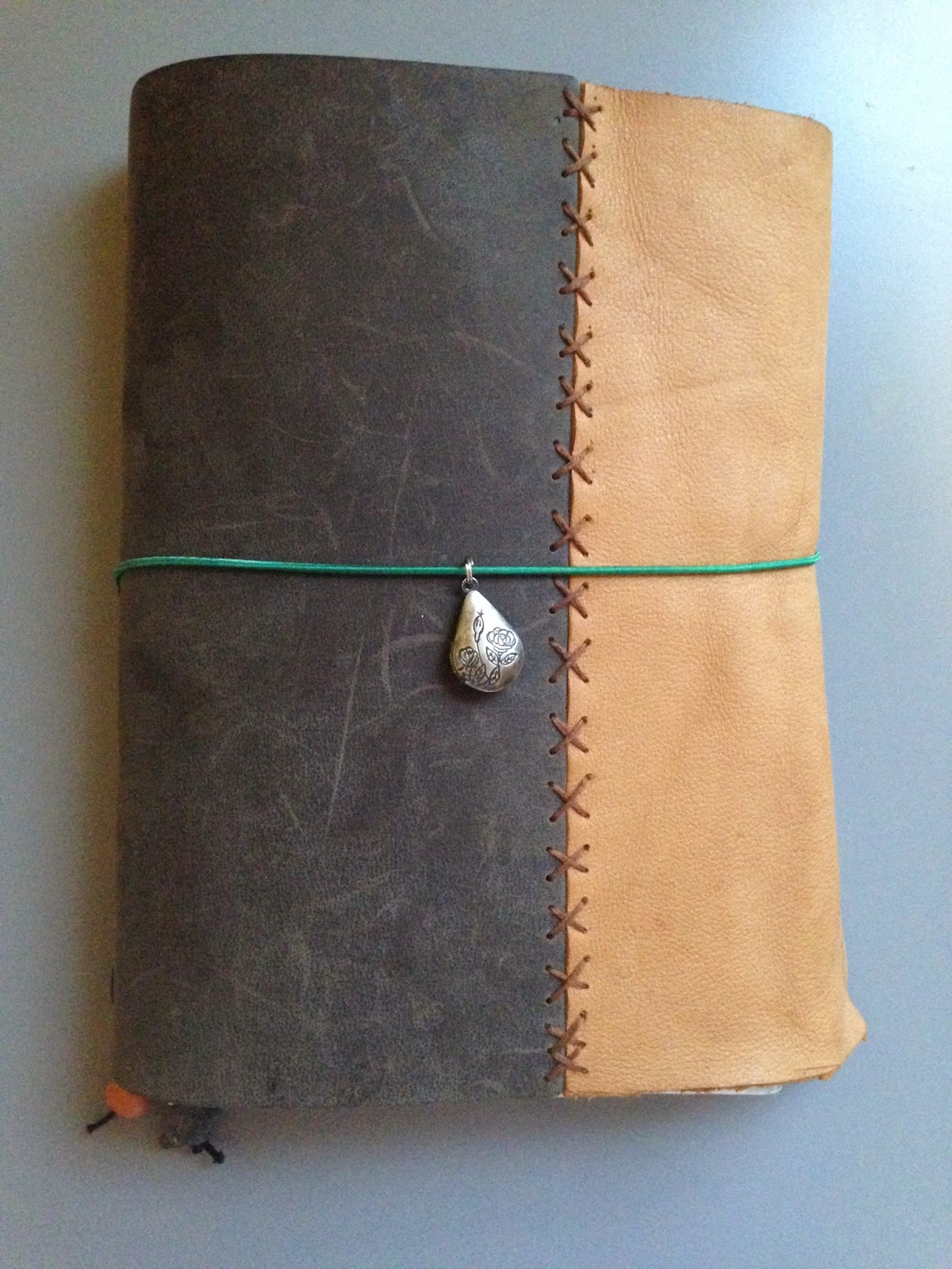 |
| My faux-dori with charm and bookmarks |
After folding the printed pages, I used waxed thread and made them into saddle-stitch booklets. Instead of binding the booklets into a single use cover I followed Sea Lemon’s tutorial to make a Traveler style notebook. I used a 8.5x11 sheet of 2mm leather that I purchased from Michaels and with embroidery floss added another 3.5 inch piece so that if I wanted my notebook to be chunky, inserts wouldn’t hang out. As opposed to the single use covers, this setup has allowed me to make some adjustments over the last month. More about that to come.
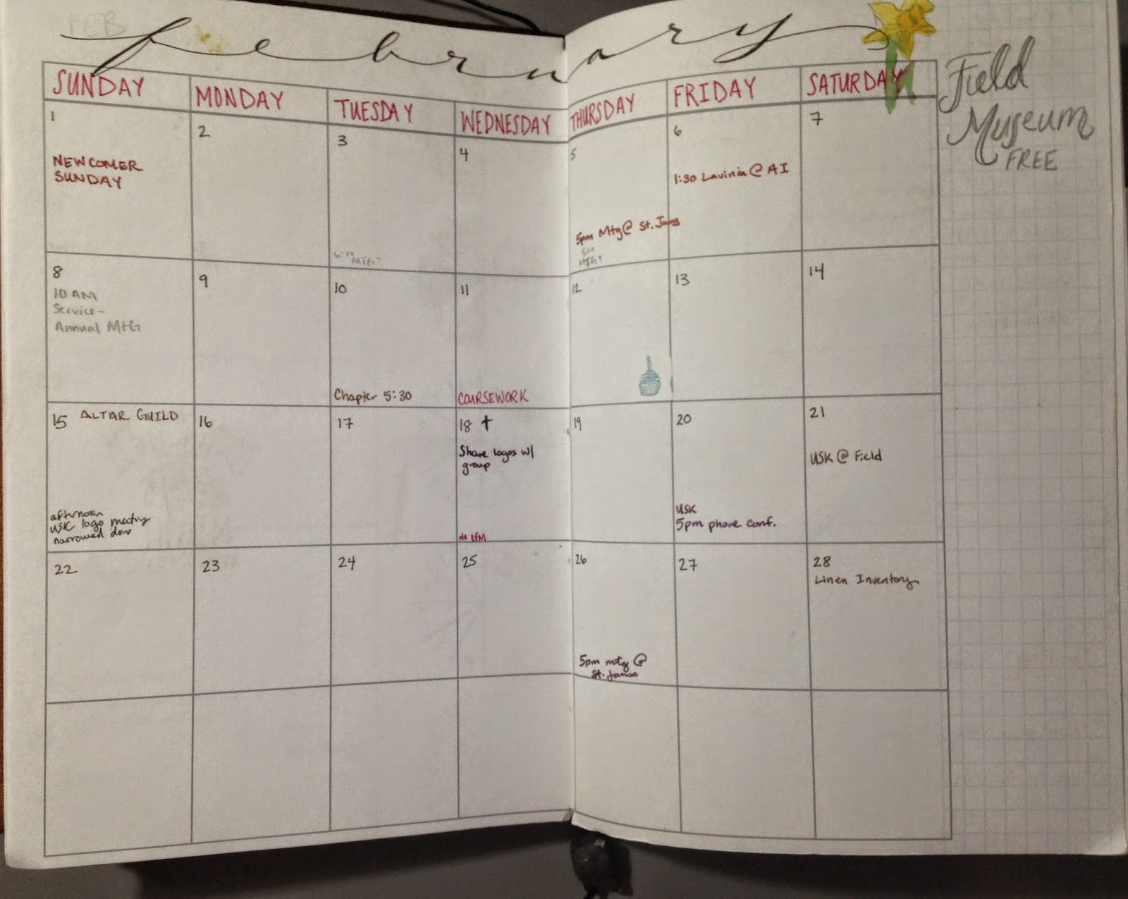 |
| Monthly overview with doodles |
When I designed the layout I wanted to have variety available in how my months or weeks would look. It has been fun filling in the months and using colors that feel right to me for each month, especially embellished with some month-appropriate doodles. I’m using a single cupcake from my birthday stickers to mark birthdays on the monthly overview and a whole cupcake sticker on the day in the weekly view. I like being able to pair things up this way so I don’t forget again if I’m only in referencing the weekly view.
 |
| Sample (clean) weekly notes page |
Possibly the most important element of this planner to me was the weekly notes page. When I first added the polar graphs to the layout I almost removed them, but two months in and I’m really enjoying them! I haven’t used the graphs like a spiral-dex as I had planed, but I like
knowing that I can easily do so for a given day or week. Instead I have a few standard things I do daily and the charts have been a great way for me to visualize them. For example on one chart I use an entire wedge to represent my “meditation” post to Instagram.
 |
| Samples for charting out my daily word-count on a story |
My most used chart is where I keep track of daily words written for a story I’m drafting out. For writing I use each section of a wedge to represent 200 words. To each her own, but 200 word increments is a sweet spot for me right now. As you can see in the image on the left I was aiming for 800 words a day and using the chart like pie wedges. Last week I tried a new variation on the writing chart to up my daily goal from 800 to 1k. This method is similar to a spiral-dex moving from inner to outer. The picture is from last Monday to show the lines better, but it was a great success last week and I met my goal every day!
Originally I had intended to keep the week notes page entirely blank for weekly to-do’s, sketches, etc. I’ve found that with the graphs along the left side of the notes page I still have room for weekly notes, quotes, and doodles. An added bonus is that with the chart I feel an incentive to do that task each day—a blank or partial wedge drives me crazy!
 |
| Beta pocket folder design |
So about the traveler’s setup. I made some extra bands with the elastic leftover from making the notebook and have 6 (or 7 depending on how you count) inserts. Besides the five inserts for the planner I also have a notebook with mixed blank and lined pages and a folder with 12 pockets, which shares an elastic with a four sheets of
“blog planner” pages from Ray Blake. The notebook insert allows me to make this the ultimate meeting
notebook: calendar + notes = success! Also, the paper in the no-name
notebook I picked up is fountain pen friendly and can hold water color
as well as the Claire Fontaine “Graf It.” When I realized that I would be reading a lot this semester it was great to be able to add in a folder suitable for index cards. I’m still testing out my beta design, but so far I’m really enjoying the pocket insert. The beta design has three index card pockets on the front cover and opens to four 6x 8.5 pockets and two more index pockets. So many index cards!
Two months in and there are only three things I would change. First, I would have printed on letter paper instead of slightly smaller. Secondly, I want a way to turn directly to a given month without twelve bookmarks dangling. This isn’t a large problem as I’m currently working on some stickers to make tabs for each month. Mostly, I wish I would have done this sooner!


No comments:
Post a Comment